
Startup communities are ecosystems of entrepreneurs, organizations, programs, and other resources that make it easier for entrepreneurs to find the resources that they need to be successful. For an ecosystem to thrive, it’s important that the players in it, whether that’s the entrepreneurs or those who support them, are able to find the knowledge and resources that are available.
To help provide the ‘lay of the land’ in our startup community, we published the first Sacramento Startup Ecosystem Diagram in June 2016. It’s amazing how the Sacramento startup community has evolved and changed over the last five years. Along with those changes, the diagram representing it has changed and evolved as well. New organizations have launched new programs to support founders at various stages in their startup’s journey. Some have faded away. New collaborations have formed to share resources and assets in delivering programs. Our ecosystem today is far different than it was five years ago when we first published the diagram. A new, updated diagram has been long overdue.
Introducing Sacramento Startup and Innovation Ecosystem Diagram v6.0
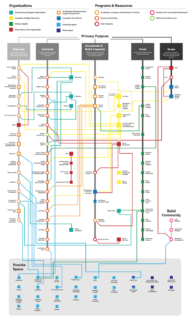
You’ll notice some fairly significant new features on this latest diagram. This version rearranges the elements in our startup community based on categories (hat tip to Growth Factory’s Monique Brown for the inspiration on these) — what I think of as the primary purpose of a program. Those categories include :
- Educate
- Connect
- Accelerate and Build Capacity
- Fund
- Scale
- Provide Space
- Build Community
I’ll be the first to admit that these categories aren’t perfectly accurate. Things don’t tend to fall into nice neat buckets in complex systems like ecosystems. But, I think it’s a good start, and I’ll update in subsequent versions based on community input.
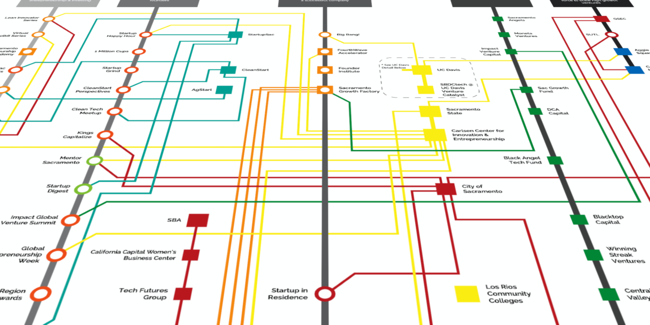
Another major change to this diagram is the distinction between organizations and programs. Previous versions didn’t make a distinction about how the two were represented. In this new version, organizations are represent by squares of varying colors and the programs that the organizations put on are represented by circular icons of varying colors.
Connecting lines between squares (organizations) and circles (programs) represent the organizations that put on those programs. Multiple lines to a program signify that multiple organizations collaborate to put on the program — a good thing in healthy startup ecosystems. In cases where there are circles/programs without a connection to an organization those might mean a couple of different things. In the case of Startup Weekend Sacramento, these events are typically organized by a group of volunteer individuals rather than an organization. In cases like the TechEdge event, these are presented by organizations that may not be represented on the diagram, like the Sacramento Business Journal in the case of Tech Edge.
Astute observers will notice a third kind of icon on the diagram — a square with a circle in it, as with the case of several accelerator programs, such as FourthWave, Evolution, SEA, etc. These represent resources that, to me, seem to be an organization whose sole or primary reason for being is an accelerator program. So, they’re kind of both an organization and a program. Hence, a combined circle and square.
A final major change to this version of the diagram is how the coworking and maker spaces are represented. In previous versions of the diagram, the coworking and maker spaces were more integrated into the diagram on their own respective “lines.” Coworking and maker spaces are essential to startup communities to provide space for convening and connections. But, many of these spaces have limited involvement in the startup community other than providing space. So, these are all collected in a block. In cases where the space is involved with programs or events, connecting lines connect them to those circular elements.
As with previous versions, UC Davis’ various programs are represented in a separate detail at the bottom of the diagram as there is so much going on at UC Davis that it warrants its own detail in order to keep the rest of the diagram from being overly complicated.
Previous versions of the diagram can be found on the diagram archives page.


Nice work!
Excellent information! Thank you for all you do to support business