As the 2016 Presidential Campaign comes to a climax this Tuesday, as an app developer, I’m going to take a few minutes to compare the official apps from each campaign. Because of the importance of mobile, I see that apps will be a crucial tool for political campaigns and it’s interesting to see how the major party candidates have implemented their mobile app strategy.
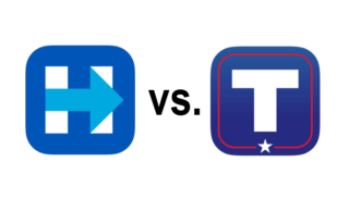
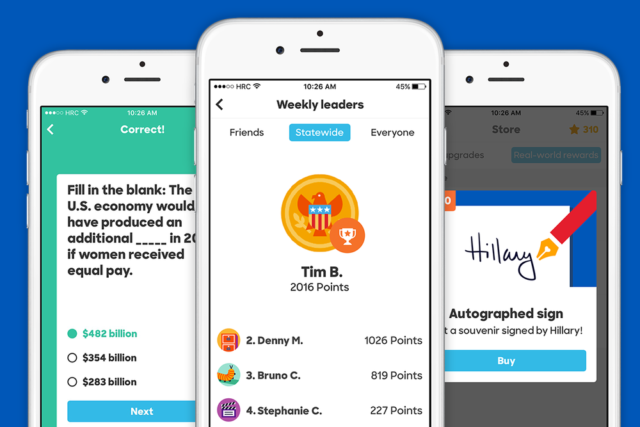
Debuting last July on iOS and now available on Android, the Hillary 2016 App is about making the election fun. It has the feel of a mobile gaming platform while incorporating strategies similar to Duolingo to rapidly gain support and simplify the ways in which users can do so. Over 100,000 people have downloaded the app and completed over 800,000 built in activities. For instance, users can be quizzed on Trump’s controversial statements or share Clinton’s photos on social networks. There is also the option of earning points by, for example, registering to vote. Users are also able to get a lot more interactive and make them feel as if they play an active role in the campaign. Gamers can experience the view of her office by swiping away on the touch screen. They can even water the plants and pet the presidential dog, Winnie! Lead developer, Stephanie Cheng, said that users pet the virtual Winnie dog an average of 5 times per day. People also have the option of contributing to the campaign, signing up for future events, checking in to current ones and read related news. The Clinton administration said that the app has caused thousands of new supporters to step up and get involved. The app has a clean and crisp look and is definitely geared towards millennials. It uses gamification and encourages users to do political focused activities with both virtual and real awards. The top award includes a signed post card by Hillary Clinton.
Trump’s team responded shortly after Clinton’s app launch with their own called ‘America First.‘ It providers users with news, videos, articles, a donation processor and social networking links. The last option allows people to contact other Trump supporters in their region. There’s also a countdown with the words that explains ‘Time Left Until We Defeat Crooked Hillary.’ The more that users participate and use the app, the higher they climb the rankings. There are a total of 8 levels starting from the ‘apprentice’ and ending with the ‘Big League.’ Users can earn points as well and even compete with others based on how deliberately they show support. The app is a lot more simplistic and was designed for an older audience despite the main consumer aged 18-29.

Image Source: Apple Store
Analysis
The main difference between the apps is the audience it targets. The Clinton app is geared towards millennials with a big focus on gamification and it has a much crisper look. As a Gen Xer, I found the app a bit annoying; I would be more interested in getting news and information which is a layer below the gaming aspect. The Trump app is geared towards an older crowd with news being in the forefront which I found more useful. With that said, I found the Trump app to be a bit cluttered and dated from a visual aspect.
One of the things that Trump app does consistently is that it sends out regular push notifications whereas in the Clinton app, I haven’t received any. I actually do wonder if the Clinton app purposely avoids sending out push notifications in fear of the user deleting the app for being annoying.
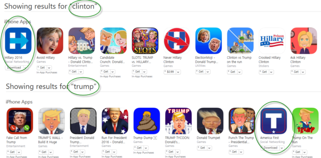
Where the Clinton app beats the Trump app is ASO (App Store Optimization). When I searched for “clinton” in the Apple App store, as expected the official Clinton Campaign app appears first. Whereas a search for “trump” the official Trump app appears 9th (after 8 Trump satire apps).
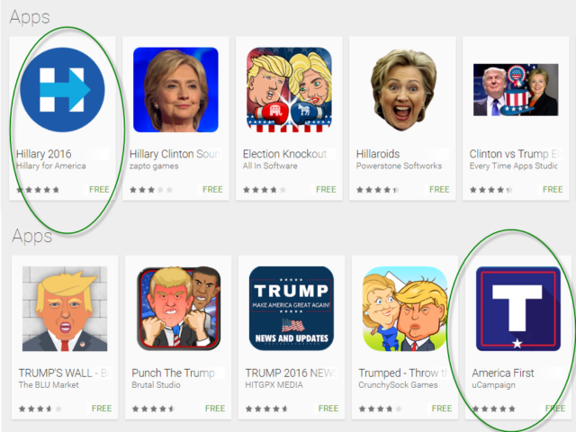
Similarly, on Google Play, the official Clinton app comes up first and the official Trump app comes up 5th.
Recommendations for Future Political apps
In conclusion, for future political campaigns that are thinking about developing an app, here are some of my recommendations:
- Focus on ASO: Don’t make your supporters have to search for your official app behind a sea of satire apps.
- Engagement is crucial: Give a reason for the user to continually use the app.
- Know your audience: design the your app for you’re the demographic that you’re targeting


